Project GOAL
About BobaTalks

🗓️ MVP Scheduling Tool
USERS
Who are we designing for?

Owl Mentor
Software engineer at Microsoft
Goals
Provide valuable guidance to students who are genuinely interested.
Manage mentorship sessions without spending unnecessary time coordinating.
Maintain a positive and seamless mentoring experience without the burden of no-shows.
Frustration
Gets frustrated when sessions are disrupted by scheduling confusion or cancellations.
Needs a more reliable and integrated tool to streamline booking and communication with mentees.

Mentee Sabrina
Recent Graduate from UCSD
Goal
Find the right mentors to guide her in career planning and industry insights.
Efficiently schedule mentorship sessions around her packed timetable.
Frustration
Struggles with outdated external calendar links, causing confusion when checking mentor availability.
Frustrated by the need to switch between pages multiple times just to secure a mentorship session.
Finds it difficult to navigate and coordinate due to the lack of centralized scheduling.
👩🏻🏫
Mentor
Problem 1 - Manual profile updates
From these interview quotes, we identified that mentors experience frustration with the current process for updating profiles. As the current reliance on admin support is seen as time-consuming.
Enhancing user control in profile editing
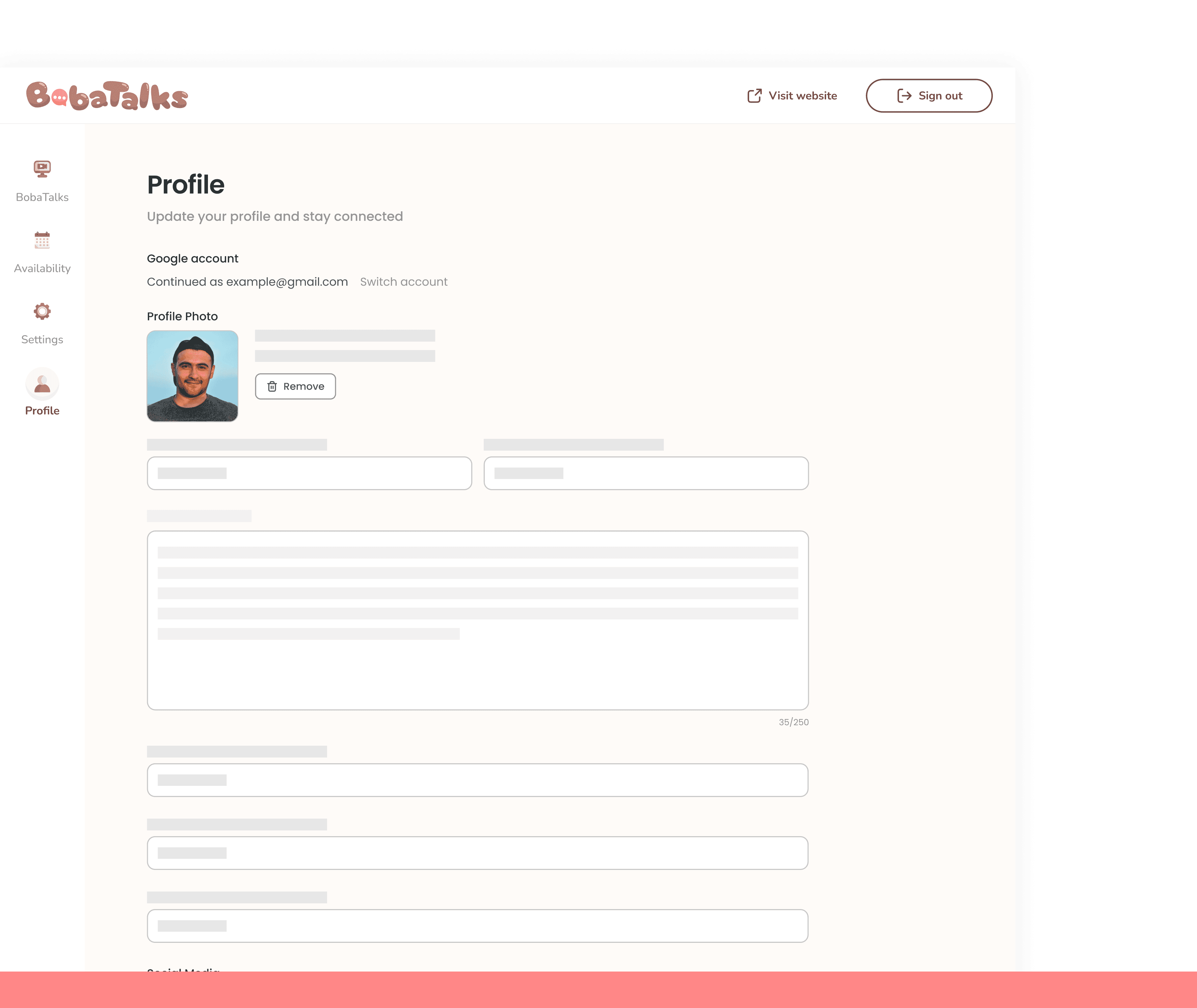
Before - Form-like review screen
In the original design, mentors were given a basic, form-like review screen. They expressed a preference for seeing how their information would be displayed on their profile.
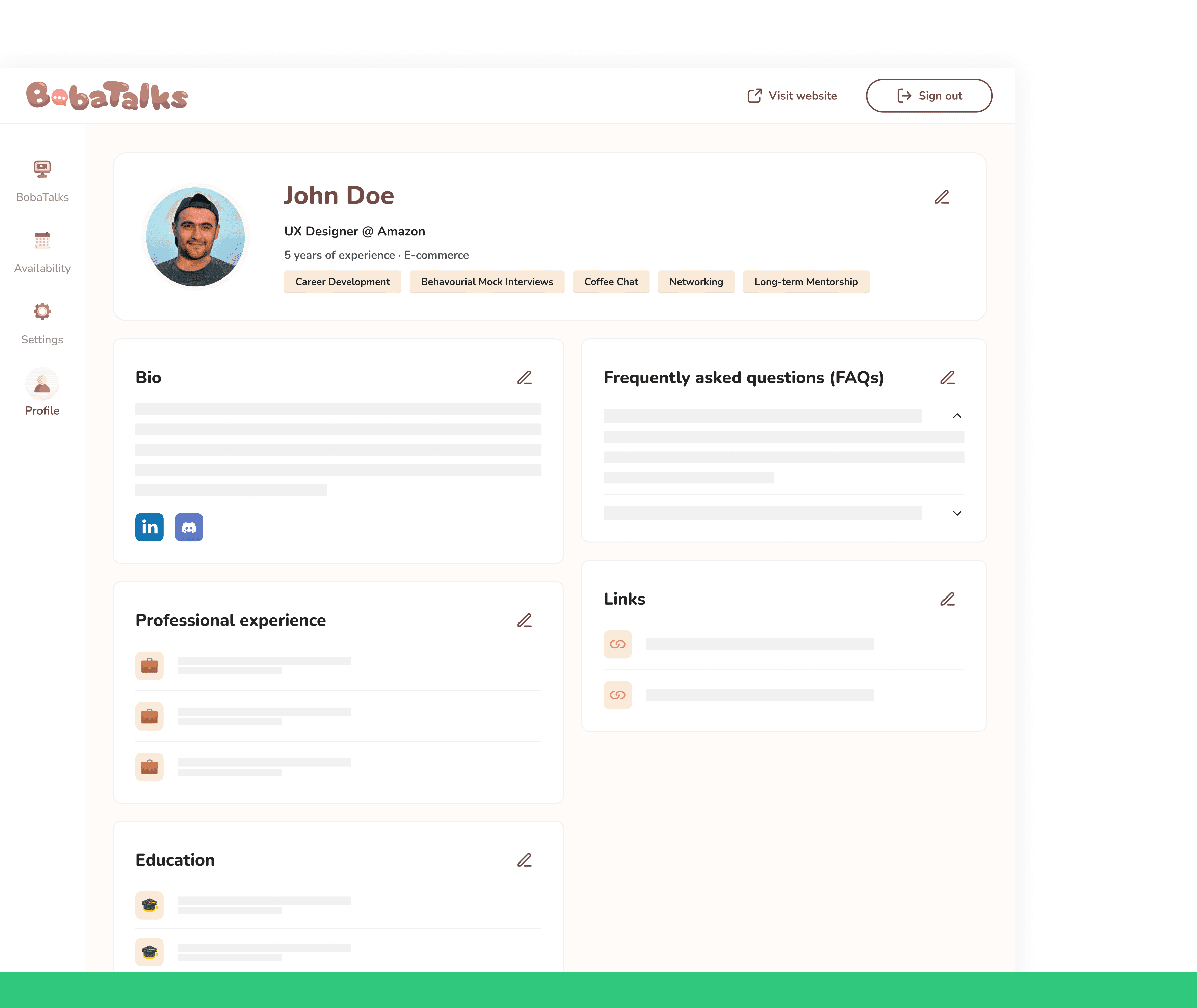
After - Realistic profile preview
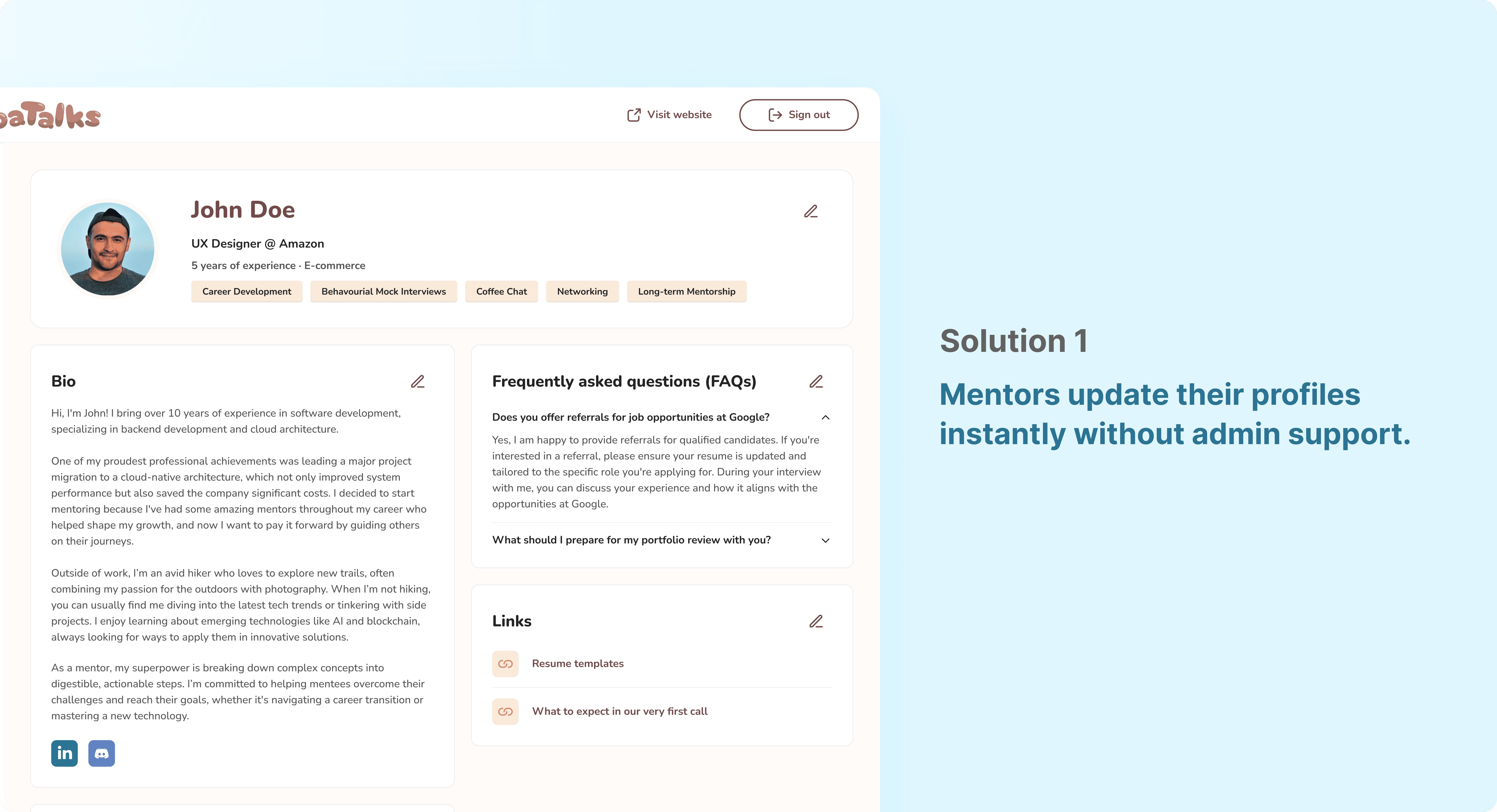
To address this, the design was updated to include a realistic profile preview, improving visibility of system status by showing mentors exactly how their profile would appear when completed.
Addresses the inefficiency of mentors needing admin assistance for profile updates.
🧑🏻🎓
Mentee
Problem 2 - Navigation challenge
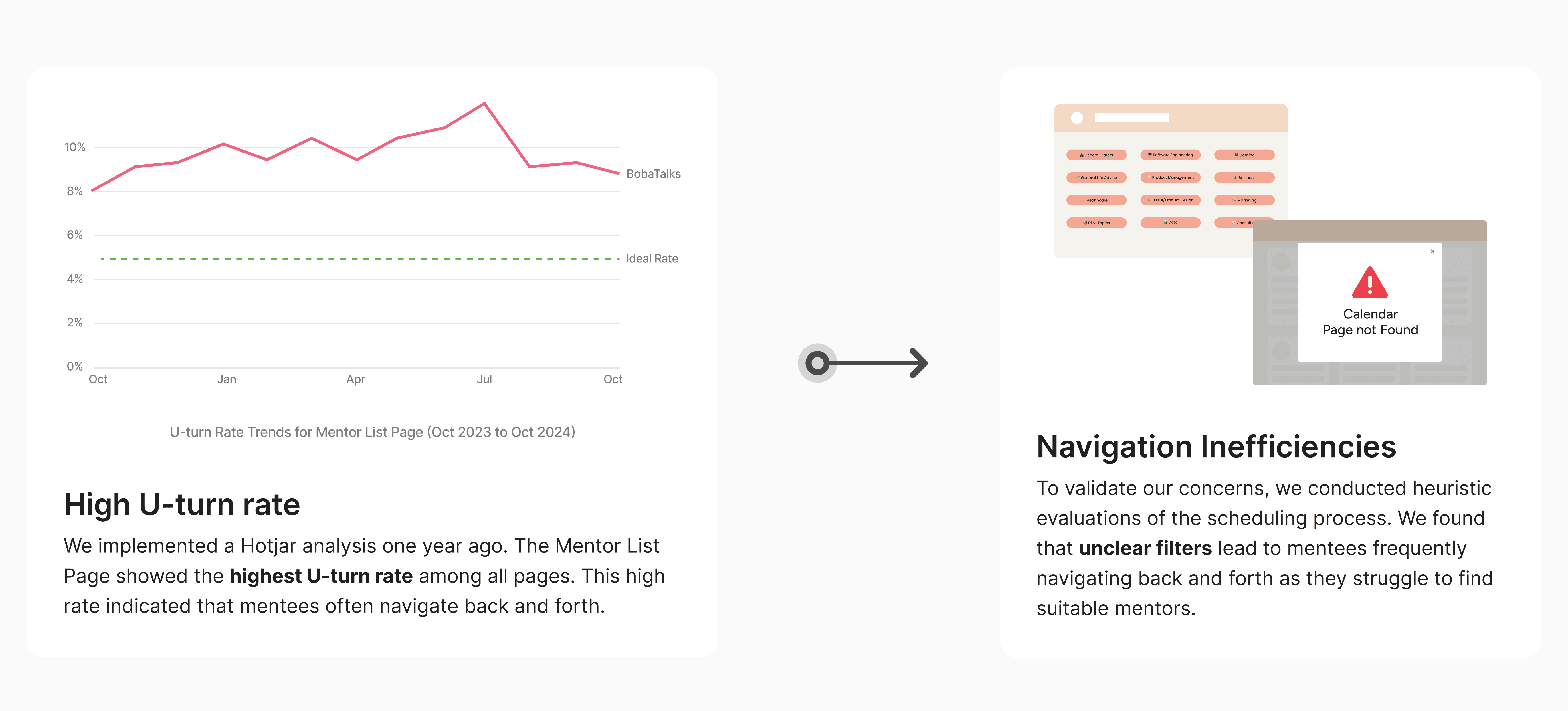
Mentees face inefficiencies due to outdated calendar links and limited availability filters. Frequent expired URLs force them to switch between pages, making mentor selection tedious and time-consuming.
Inefficient mentor filtering and navigation
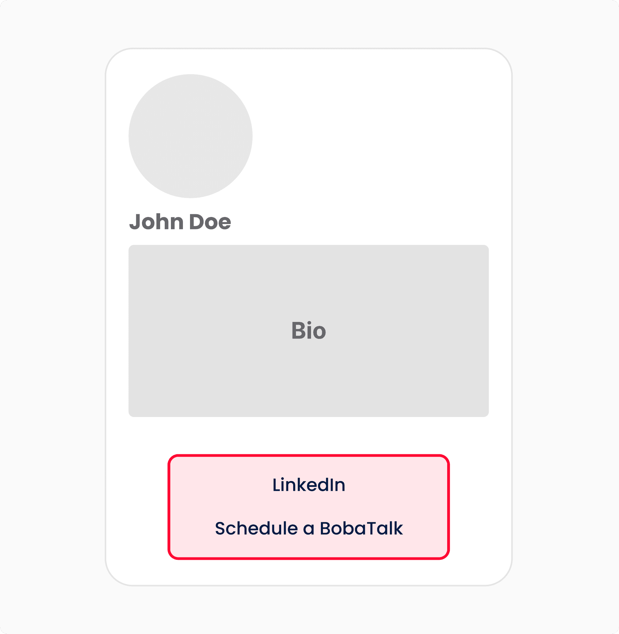
Unclear button design
Current button layout lacks clarity, making it difficult for users to quickly identify key actions like accessing LinkedIn or scheduling a session.
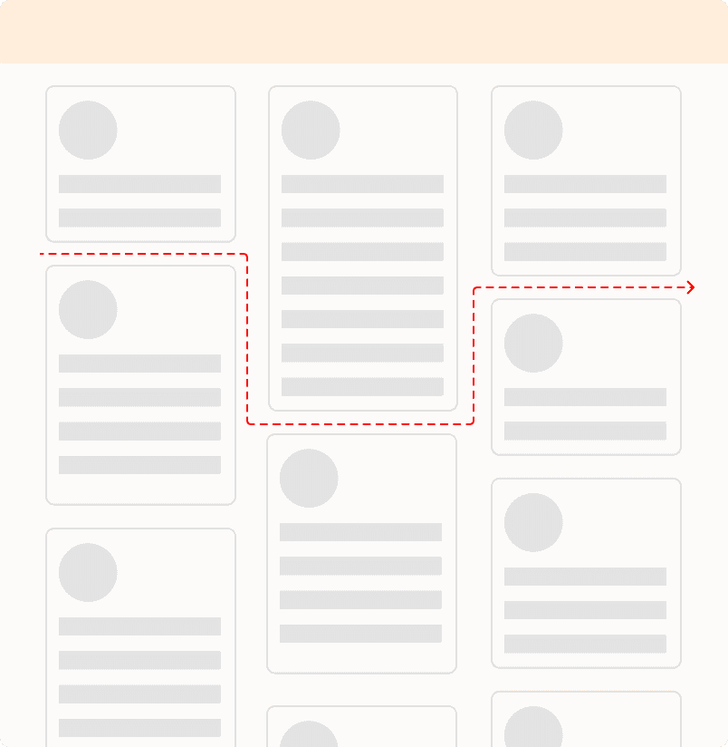
Varying card length
Inconsistent card lengths create a disjointed layout, making it harder for users to visually scan and compare mentors effectively.

Long mentor list
Long list leads to excessive scrolling, complicating the process of finding relevant information quickly and efficiently.
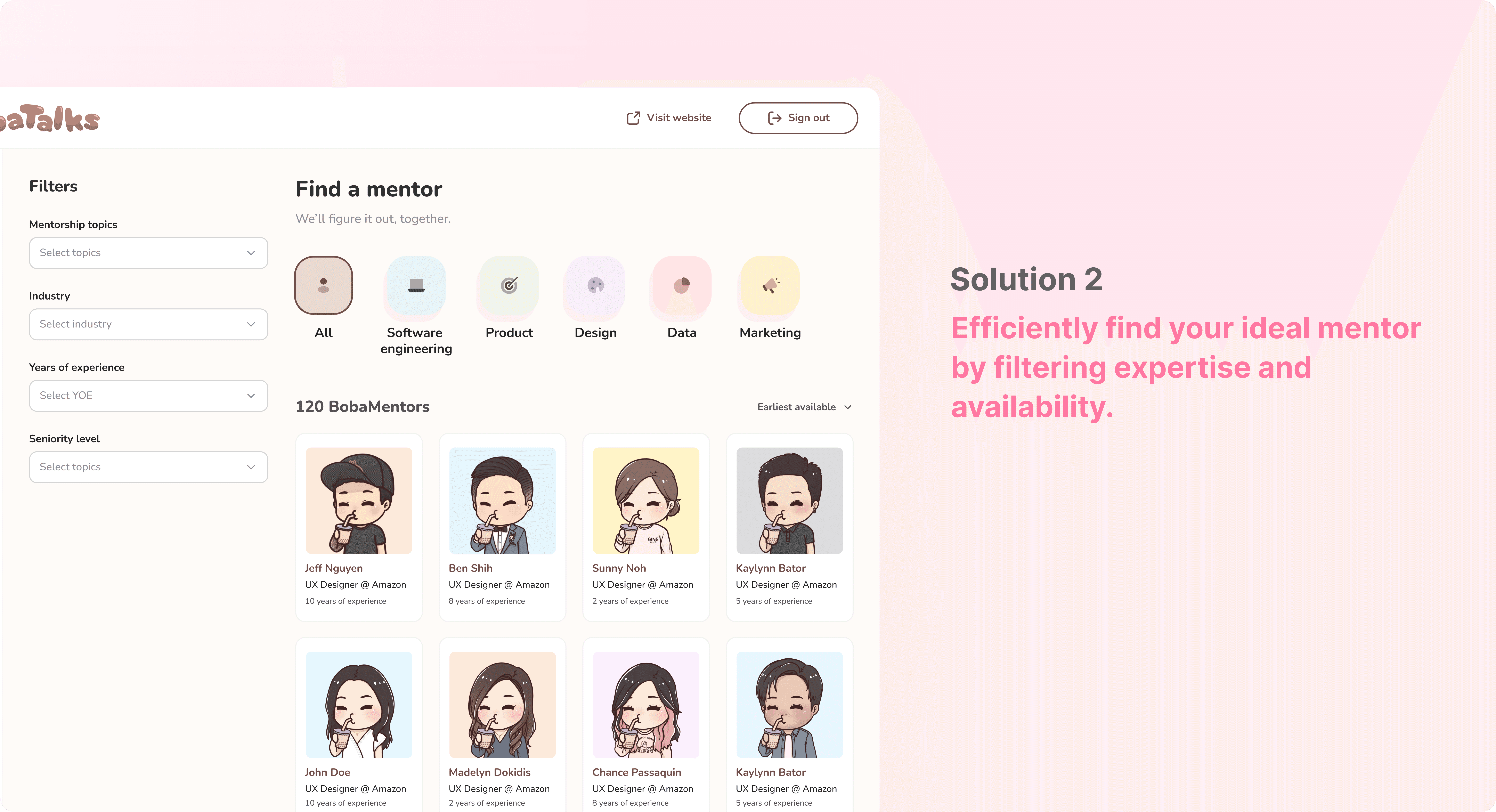
Filters mentors by expertise and availability, saving time.
👩🏻🏫🧑🏻🎓
Shared
Problem 3 - Limited Pre-Meeting Context
The current design provides only basic details for both mentees and mentors, restricting each party to prepare effectively.
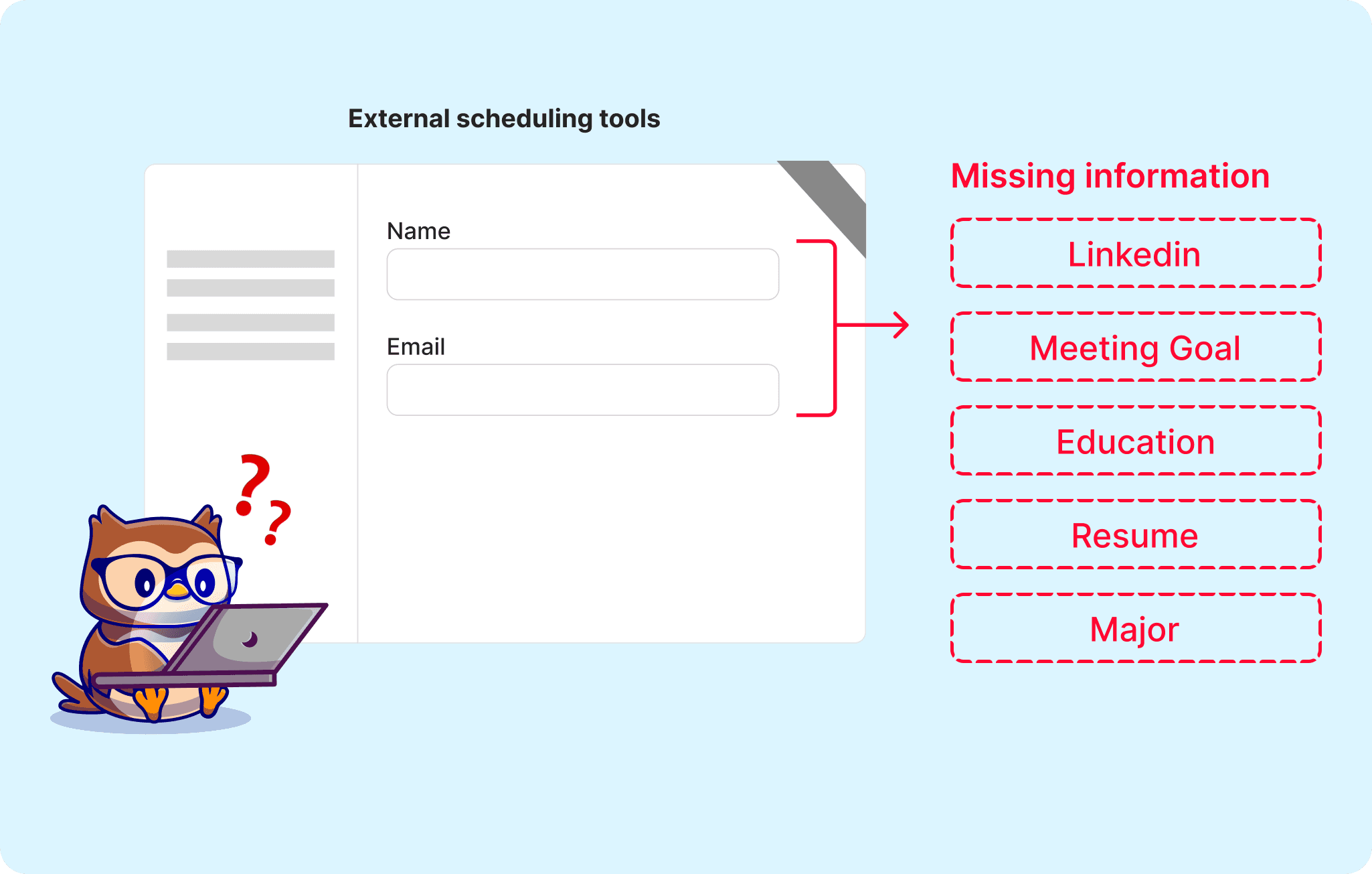
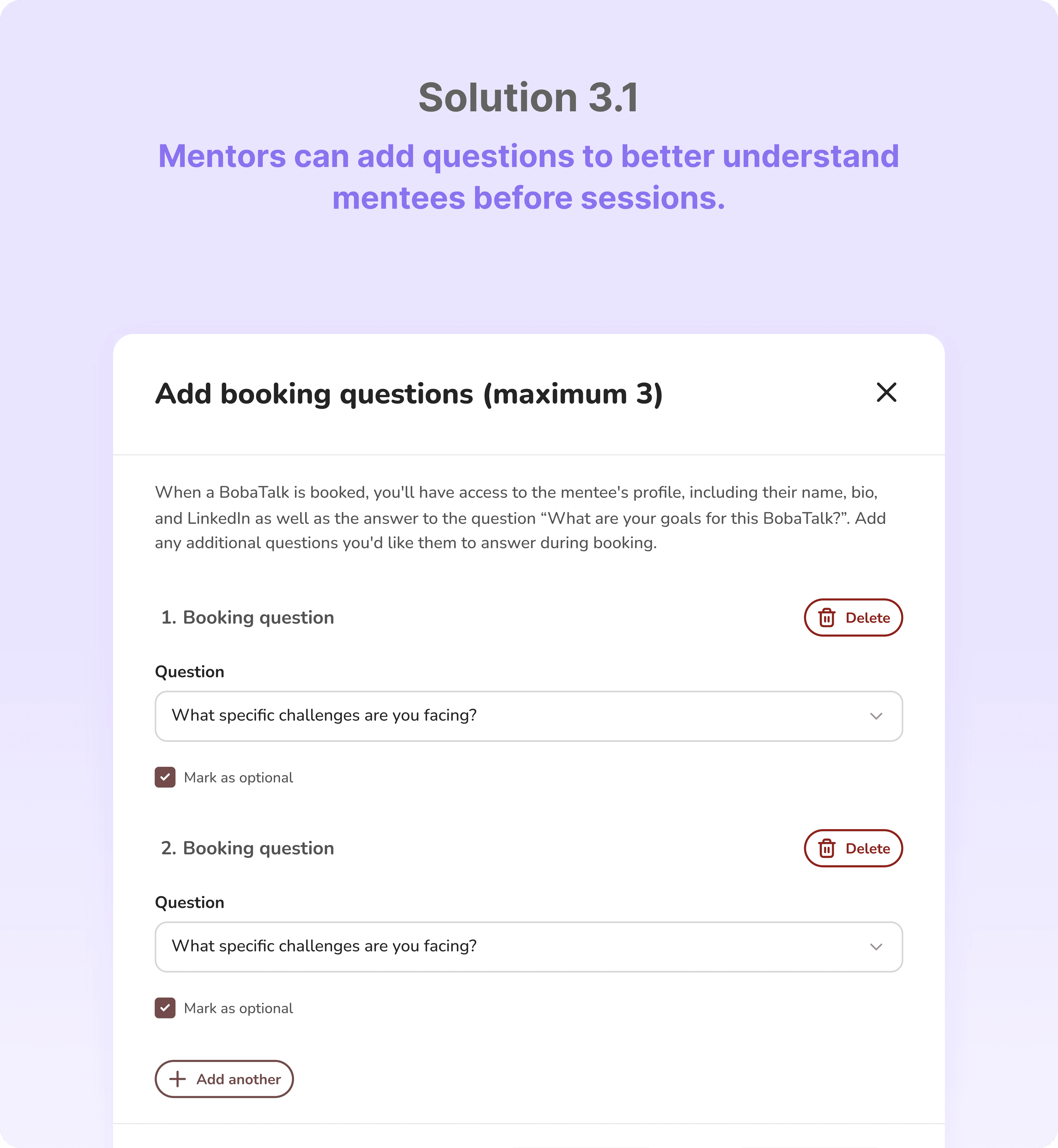
From our survey, 73% of mentors feel that the current design lacks essential mentee information. As we relies on external calendar like calendly which are not customized to capture key data
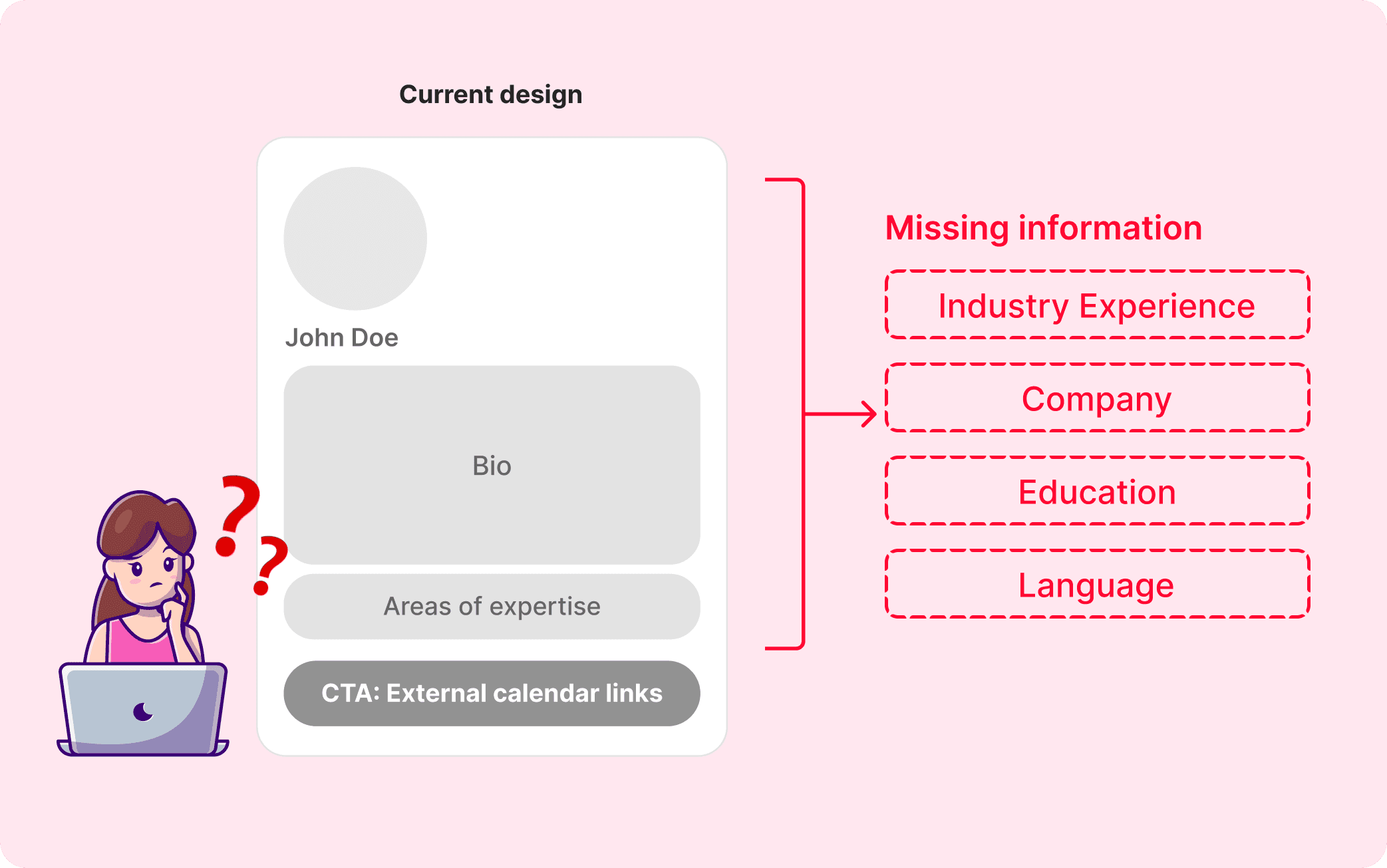
From our survey, 73% of mentors feel that the current design lacks essential mentee information. As we relies on external calendar like calendly which are not customized to capture key data
Streamlined profile design
Iteration 1.1
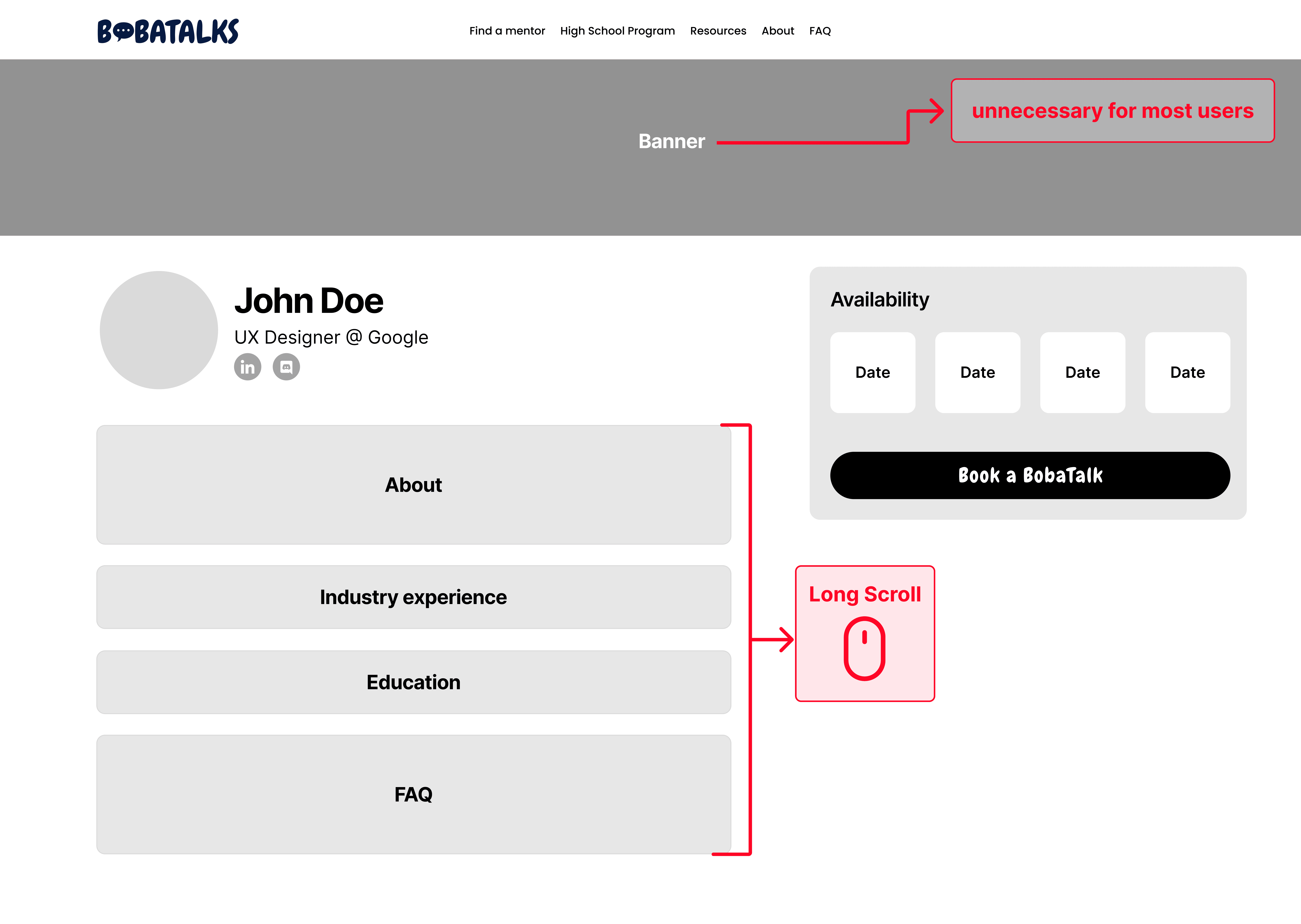
Unnecessary banner
The large banner may be unnecessary for most users and could lead to a cluttered look
Long scrolling content
The vertical stacking of content can lead to more scrolling.
Iteration 1.2
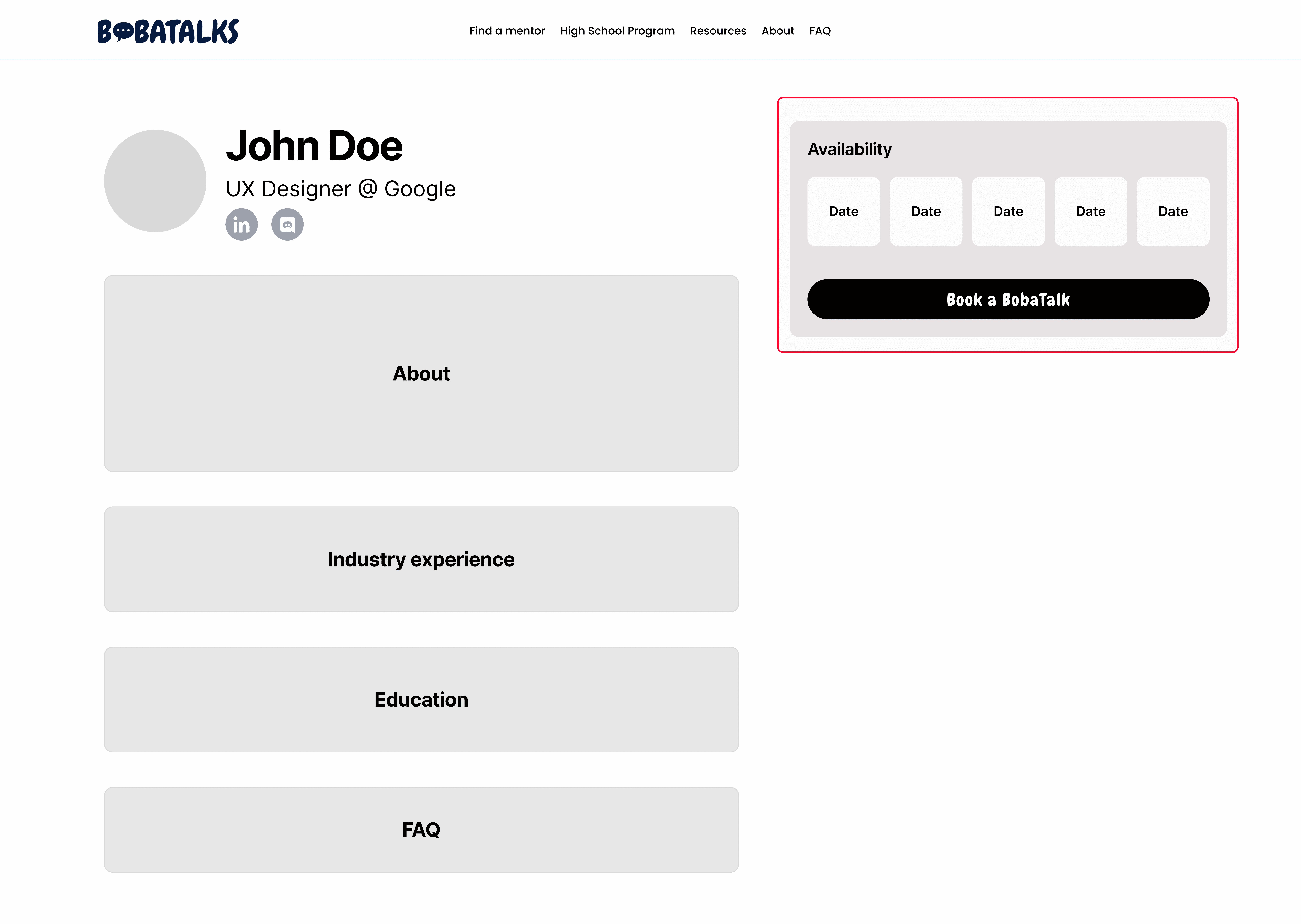
Prominent CTA placement
The "Book a BobaTalk" button is placed near the top, which might be premature if users need more context or information about the mentor before taking action.
Iteration 1.3
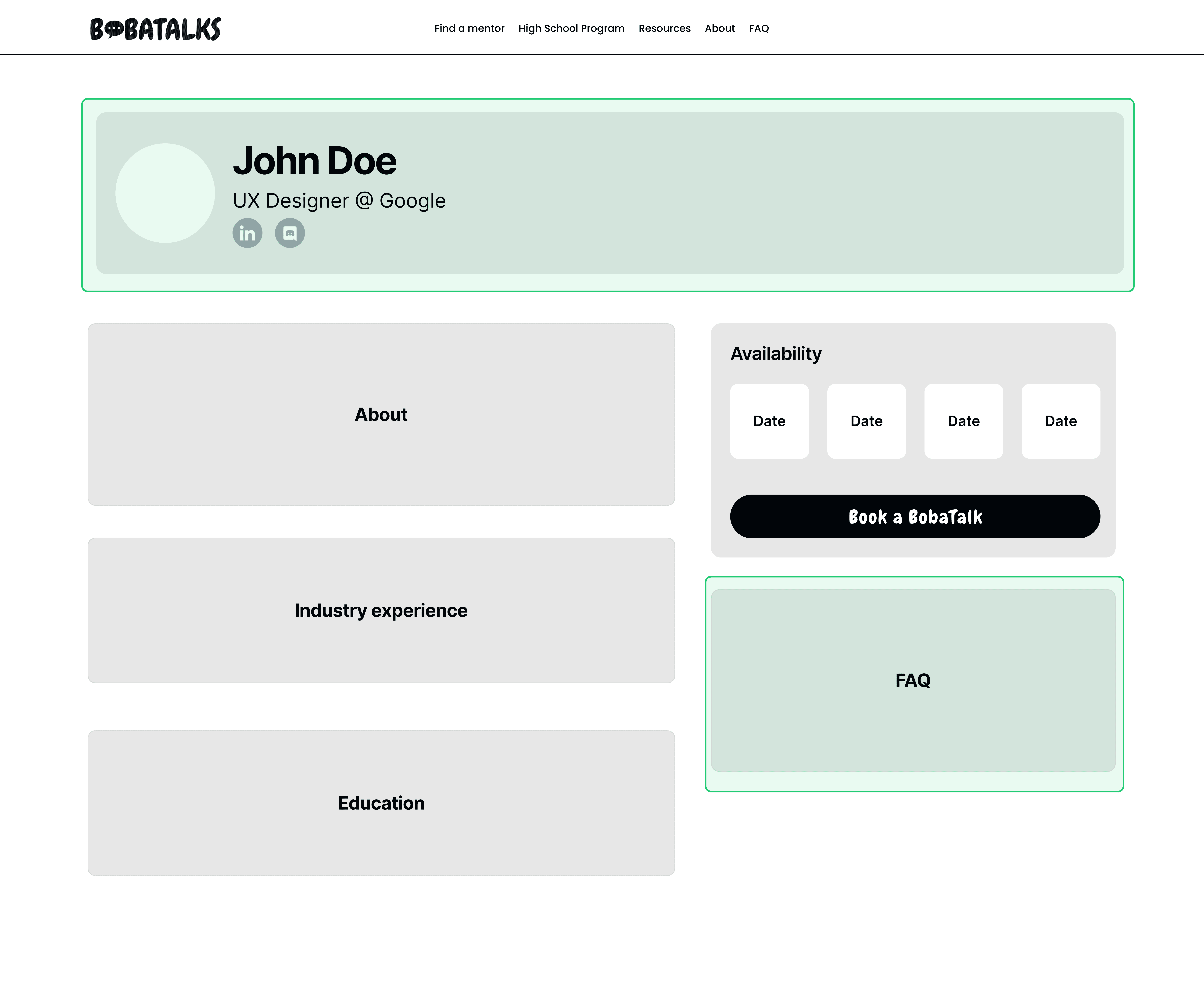
Creating a clear focus with a buffer zone
Combining the banner and names into a buffer zone improves visual separation and ensures users have adequate time to read and absorb all content before engaging with a call-to-action.
Strategic Placement of FAQ
Placing the FAQ section near the "Book a BobaTalk" CTA ensures that mentees can easily access important information and common questions before booking. This encourages informed decisions, reduces potential confusion
Adds booking questions and detailed profiles, improving pre-meeting preparation.
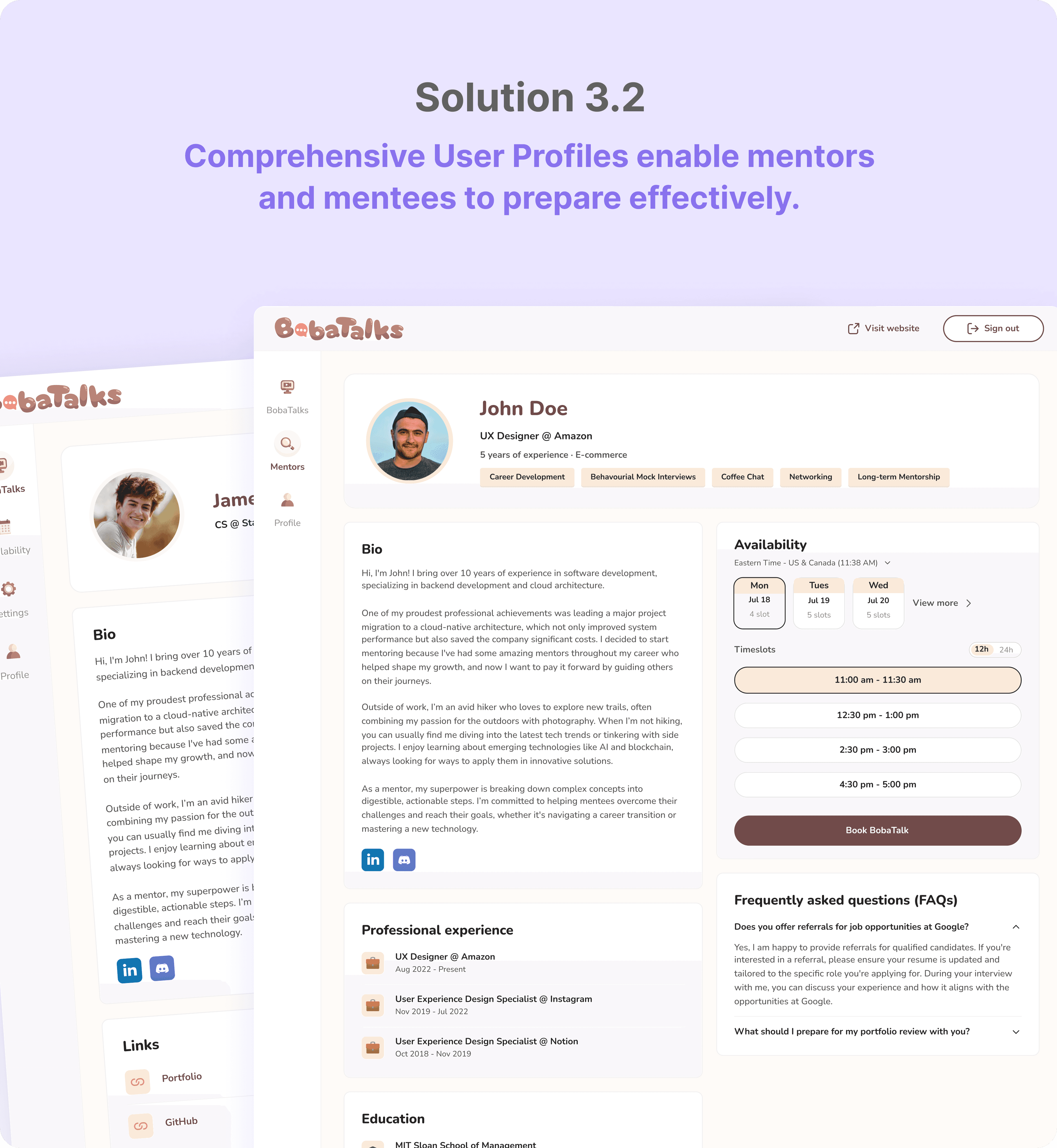
Makes the website visually playful, cute and engaging.
